The story so far: The African Union (AU) has endorsed the ‘Correct the Map’ campaign to replace the Mercator map projection with alternatives such as the Equal Earth map. At the heart of this demand is the charge that the Mercator projection, still widely used in schools, media, and online platforms, systematically distorts the sizes of landmasses, shrinking Africa while inflating Europe, North America, and Greenland. By backing the call, the AU has expressed hope that a fairer projection will restore geographical accuracy and correct what it characterises as centuries of symbolic marginalisation.
Why is the Mercator map under fire?
The Mercator projection was designed in 1569 by Flemish cartographer Gerardus Mercator, who was trying to solve a navigation problem. When a ship follows a fixed compass direction, the path it traces – called the rhumb line – is a curve on most flat maps. This made it awkward for sailors to translate a bearing into a usable course they could plot on a chart.
Mercator’s projection stretched the north-south scale so that all rhumb lines appeared as straight lines. Sailors could now draw a straight line across the map at a chosen compass angle and follow that heading consistently at sea. Thus, together with Edward Wright’s 1599 mathematical tables, the Mercator projection is believed to have catalysed European exploration and colonial expansion. To achieve this convenience, Mercator distorted scale: landmasses close to the poles appeared larger while those near the equator appeared smaller than in reality.
As a result, Africa, which covers 30 million sq. km, often appears on Mercator maps roughly as large as Greenland, which is 14x smaller. Europe also looks comparable in size to Africa although the continent is a third as large. Similarly, Canada, Russia, and northern Europe appear bloated while tropical regions like Africa, South America, and India are diminished.
Over time, wall maps in offices, atlases, and on digital platforms defaulted to Mercator’s rectangular format because it was familiar and convenient, further reinforced by textbooks of the 20th century.
However, critics have argued that such distortions subtly condition how people perceive relative importance. A continent depicted as smaller seems less powerful and even less worthy of attention.
Why are maps distorted?
There is no perfect way to flatten the surface of a sphere onto a rectangle, rendering every map a compromise. Mathematicians and cartographers tasked with projecting a globe onto a plane need to distort one or more of area, shape, distance or direction. Experts have said the choice of which property to preserve and which to surrender is a technical as well as political act.
The Mercator projection is a conformal map, which means it preserves local shapes and angles. But to achieve this, Mercator stretched landmasses near the poles, inflating their apparent size and diminishing those of equatorial regions like Africa and South America.
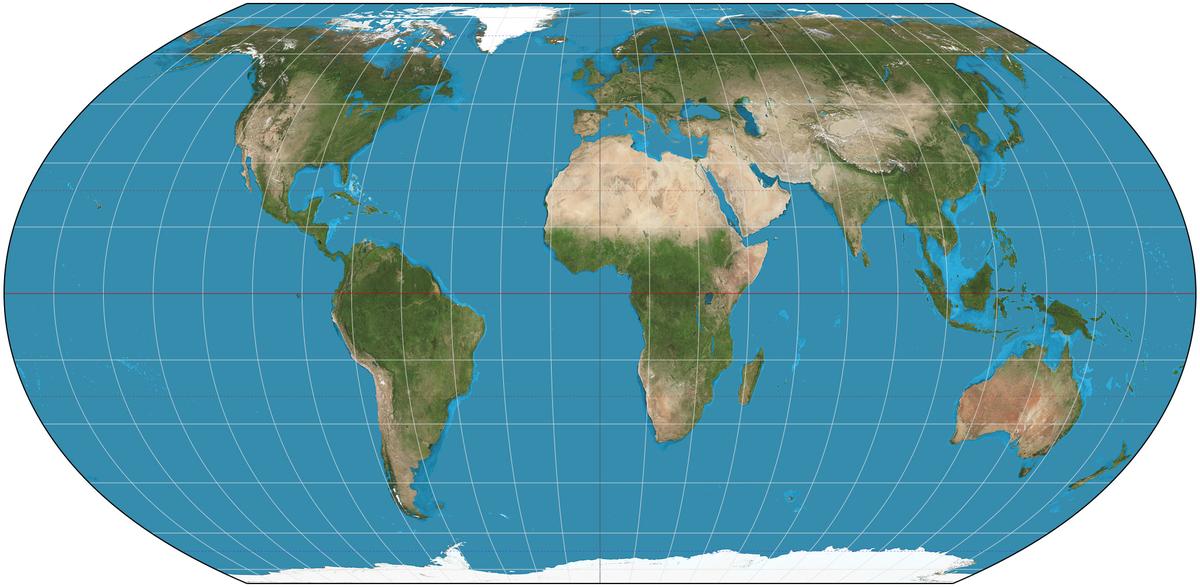
By contrast, the Equal Earth projection preserves the relative sizes of continents and countries, ensuring that Africa appears far larger than Europe or Greenland, as it is in reality. However, landmasses also appear curved or stretched. The orthographic projection makes a different trade-off. It portrays the earth as it would look from space, as if viewed from a great distance. While this choice makes it visually intuitive, this projection is limited by the fact that it shows only one hemisphere at a time and areas near the edges appear compressed.

The Equal Earth projection preserves the relative sizes of continents and countries, ensuring Africa appears far larger than Europe or Greenland, as it is in reality. However, landmasses also appear curved or stretched.
| Photo Credit:
Strebe (CC BY-SA)
How does the distortion affect Africa?
Experts have said for many years now that the Mercator projection has reinforced Africa’s marginalisation in the global imagination. By making the continent look small, the map suggested, consciously or not, that Africa was less consequential. This perception seeped into textbooks, policymaking, and popular culture.
As Rabah Arezki, a former World Bank economist, has said, the “standard projection was a political tool” that aided colonial domination, making Africa look “small and conquerable then” and “irrelevant now”. Likewise, the AU’s deputy chairperson Selma Malika Haddadi has described the Mercator map as falsely portraying Africa as “marginal”.
Thus, the AU as well as advocacy groups like Africa No Filter and Speak Up Africa have articulated a move away from the Mercator projection as a way to reclaim dignity.
What happens next?
The leading alternative to the Mercator projection is the Equal Earth projection, created in 2018 by Tom Patterson (US National Park Service), Bojan Šavrič (then with American GIS company Esri), and Bernhard Jenny (Monash University, Australia). It preserves relative areas sacrificing shape, i.e. continents appear stretched or curved.
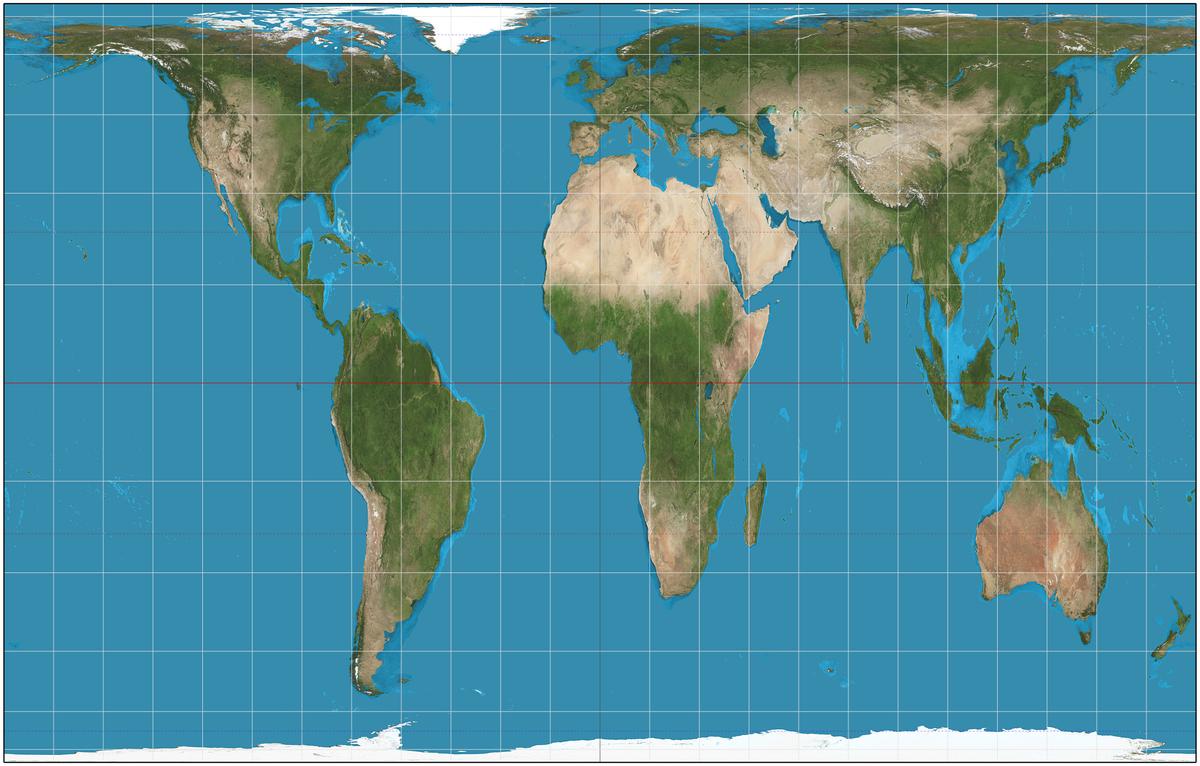
Another option is the Gall-Peters projection repopularised in the 1970s. It also preserves area but stretches continents vertically, making them appear elongated. Just as Mercator wanted to help sailors, as political scientist Arthur Klinghoffer wrote in his 2006 book, ‘The Power of Projections’, “Peters was trying to challenge basic assumptions inherent in the Mercator projection with the aim of influencing social and political attitudes. His elongated images were shocking, and made people examine their cartographical frame of reference.”

The world as depicted in the Gall-Peters projection.
| Photo Credit:
Strebe (CC BY-SA)
In 1979, a 21-year-old Australian named Stuart McArthur published the “Universal Corrective Map of the World” that turned the world map 180° and showed Australia at the top. He was reportedly sick of being teased as being from “Down Under”.
The AU’s endorsement is the most significant institutional backing yet for the ‘Correct the Map’ campaign. Campaigners have also petitioned the U.N. Committee of Experts on Global Geospatial Information Management to adopt Equal Earth. The World Bank has already said it is phasing out Mercator in favour of Equal Earth. National Geographic and NASA’s Goddard Institute for Space Studies have also been using it. Google Maps introduced a 3D globe option in 2018, although its mobile app still defaults to Mercator.
This isn’t expected to be easy, however, as the Mercator projection is entrenched in classrooms, news graphics, and even some AU-affiliated websites. Displacing it altogether will entail revising textbooks, redesigning curricula, updating digital interfaces, and overcoming institutional inertia.
Published – August 22, 2025 11:15 am IST
www.thehindu.com (Article Sourced Website)
#Whats #issue #Africa #shown #maps #Explained
